CROBIS TACHIKAWA
Project Management / Design / Construction
BUILDING RENEWAL
364.81㎡
Repositioning of a 30-plus-year-old office building to blend in with the peaceful surrounding environment
To update the image and to improve the value of an office building located in Tachikawa City, Tokyo, we carried out the renovation of the façade, the entrance, the elevator lobby, common areas, and so on. Respecting the good old simple and solid design of this upscale building completed in 1991, we improved the level of comfort and updated its image to one that is more welcoming and likable.
CONCEPT
We wanted to update the building’s rather serious image associated with its over 30 years of history and the heavy-looking structure. So, although it is several hundred meters away from the nearest train station, we took advantage of its location really close to Showa Kinen Park, a vast urban green space where you can enjoy beautiful nature, and aimed at creating a delightful place that would maintain harmony with the peaceful surrounding environment.
PLANNING
In a building renovation project, it is crucial to accurately communicate our vision for the outcome to the client and to have them understand the benefits and the significance of renovation. So, in this project, we proposed a basic concept that would evoke the image of wood, in order to update, and at the same time to ensure harmony with, the heavy-looking structure of the building constructed with real granite and marble. We were sure that we could turn the concept into reality by incorporating materials with antiqueness, stone patterns, and woodgrain patterns.
DESIGN
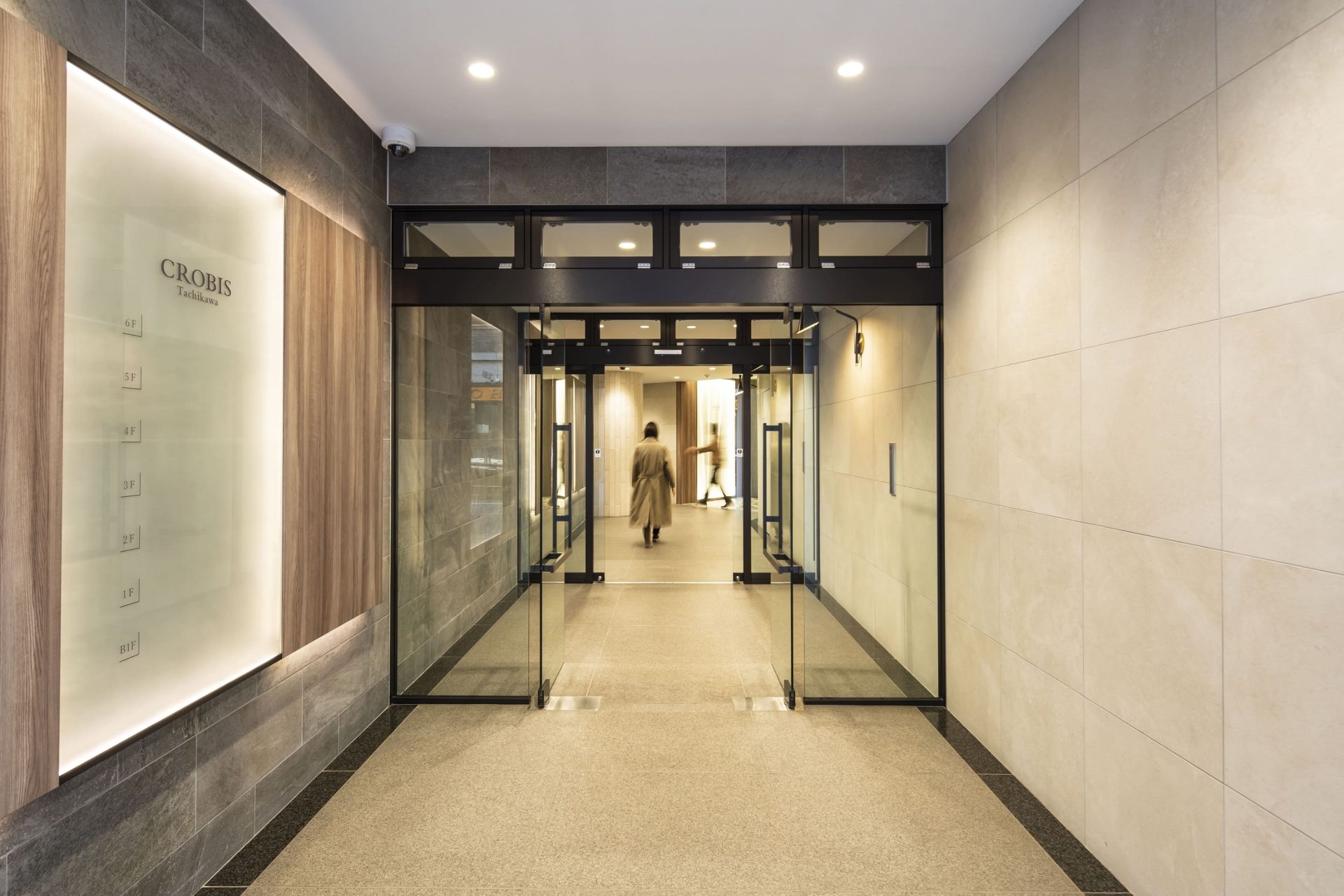
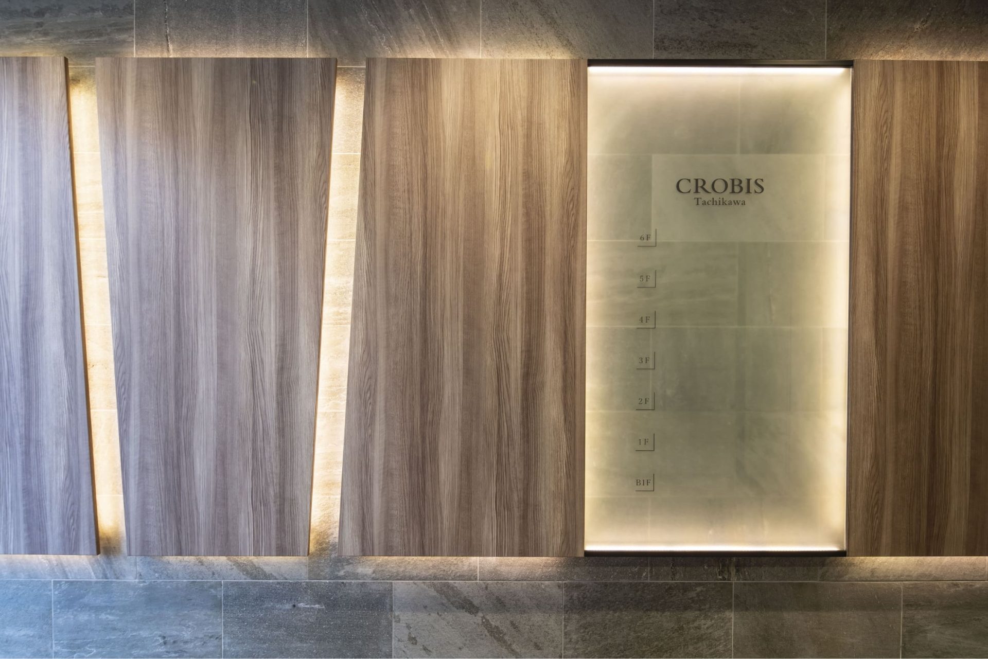
In the long, distinctive hallway extending from the entrance to the elevator lobby that we used as the starting point for our design, we installed woodgrain panels that conjure images of natural trees, tiles that resemble leaves, and an impressive floor directory with white poles, which are illuminated from above and below, and which resemble tree trunks. Designed as a lovely path connecting the office building and the lush external environment including Showa Kinen Park, the hallway symbolizes the whole concept of the project.
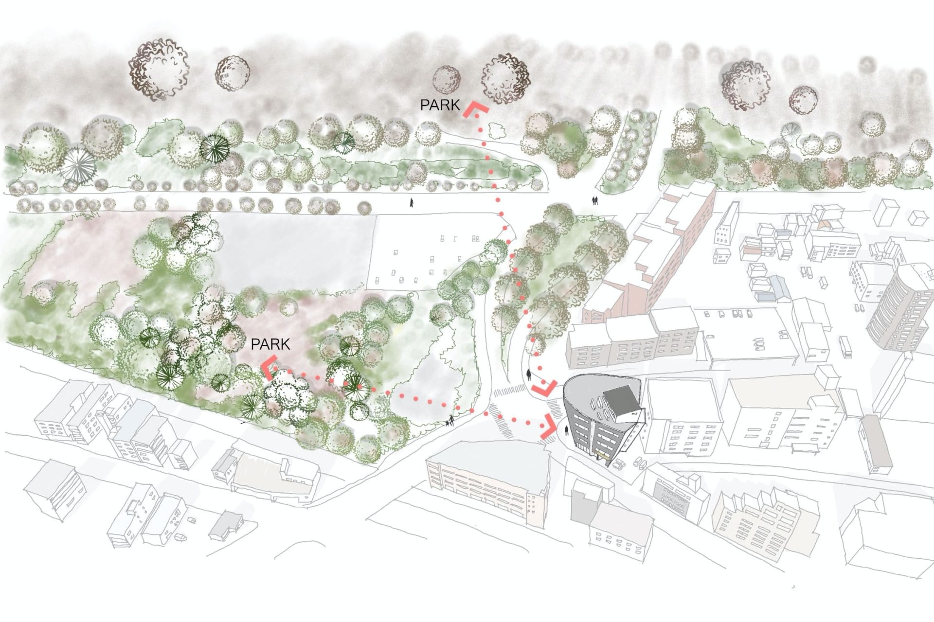
On the northwest side of the building, there is the vast, lush urban green space of Showa Kinen Park. As a base for our design, we tried to ensure harmony with such an environment.
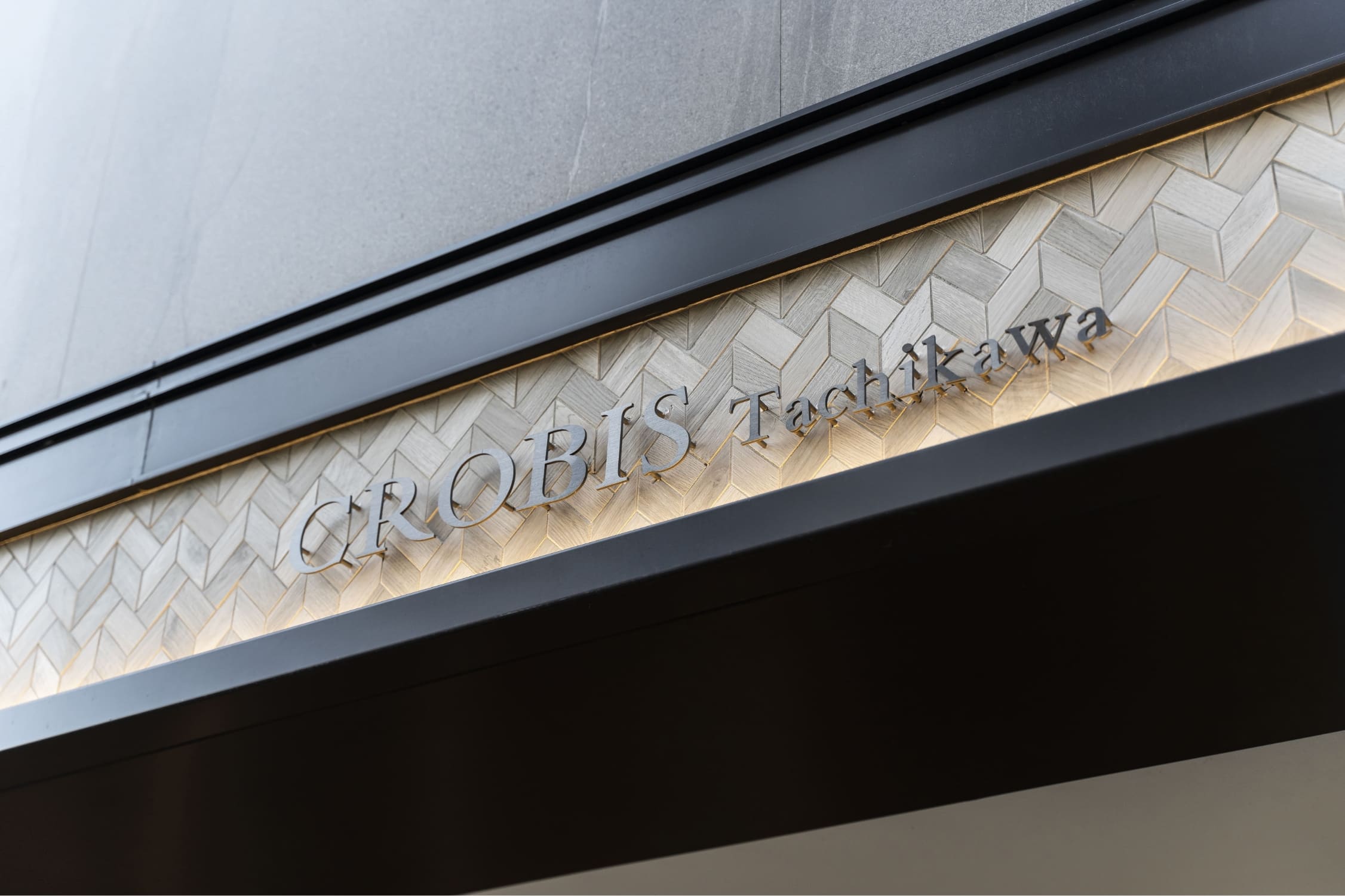
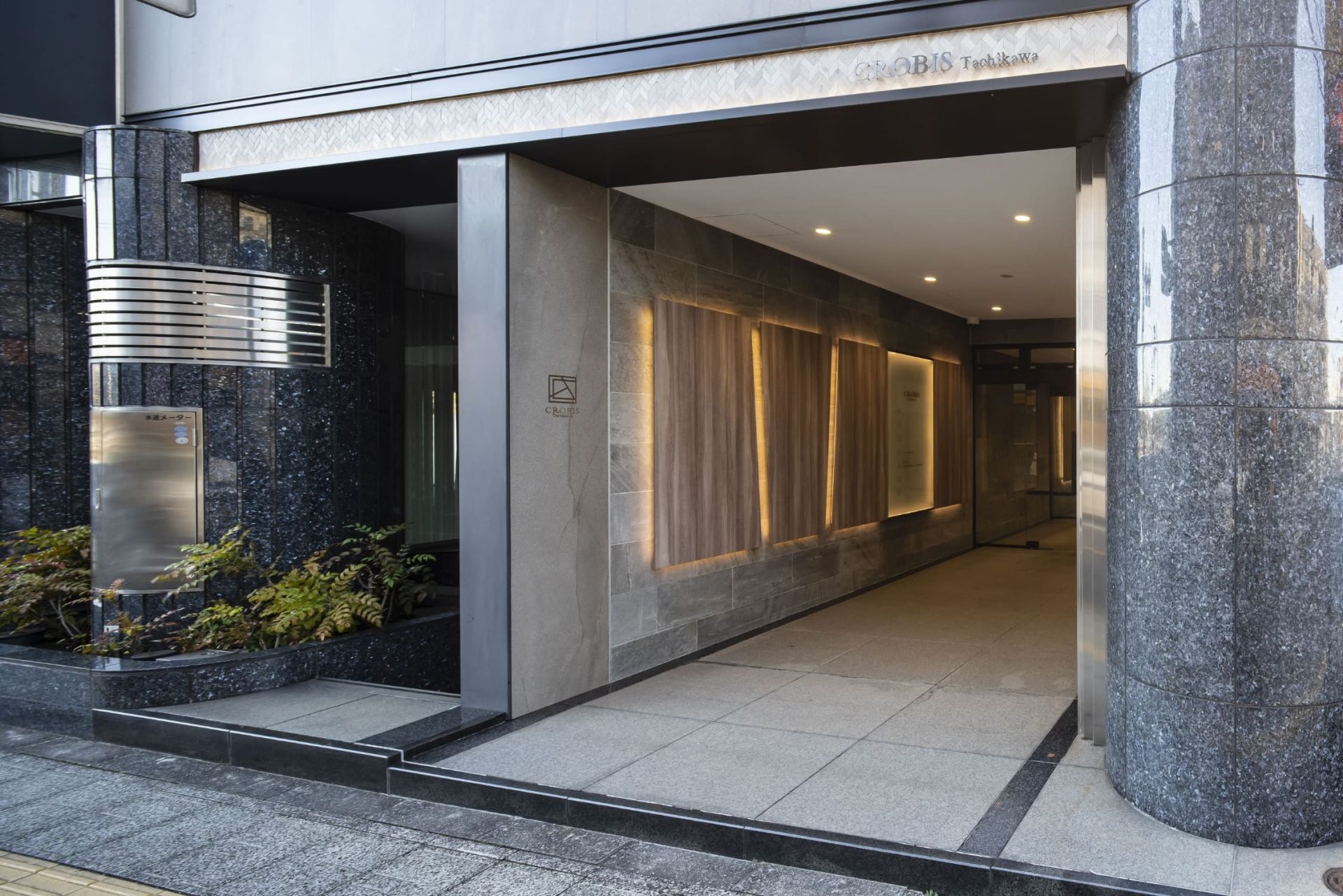
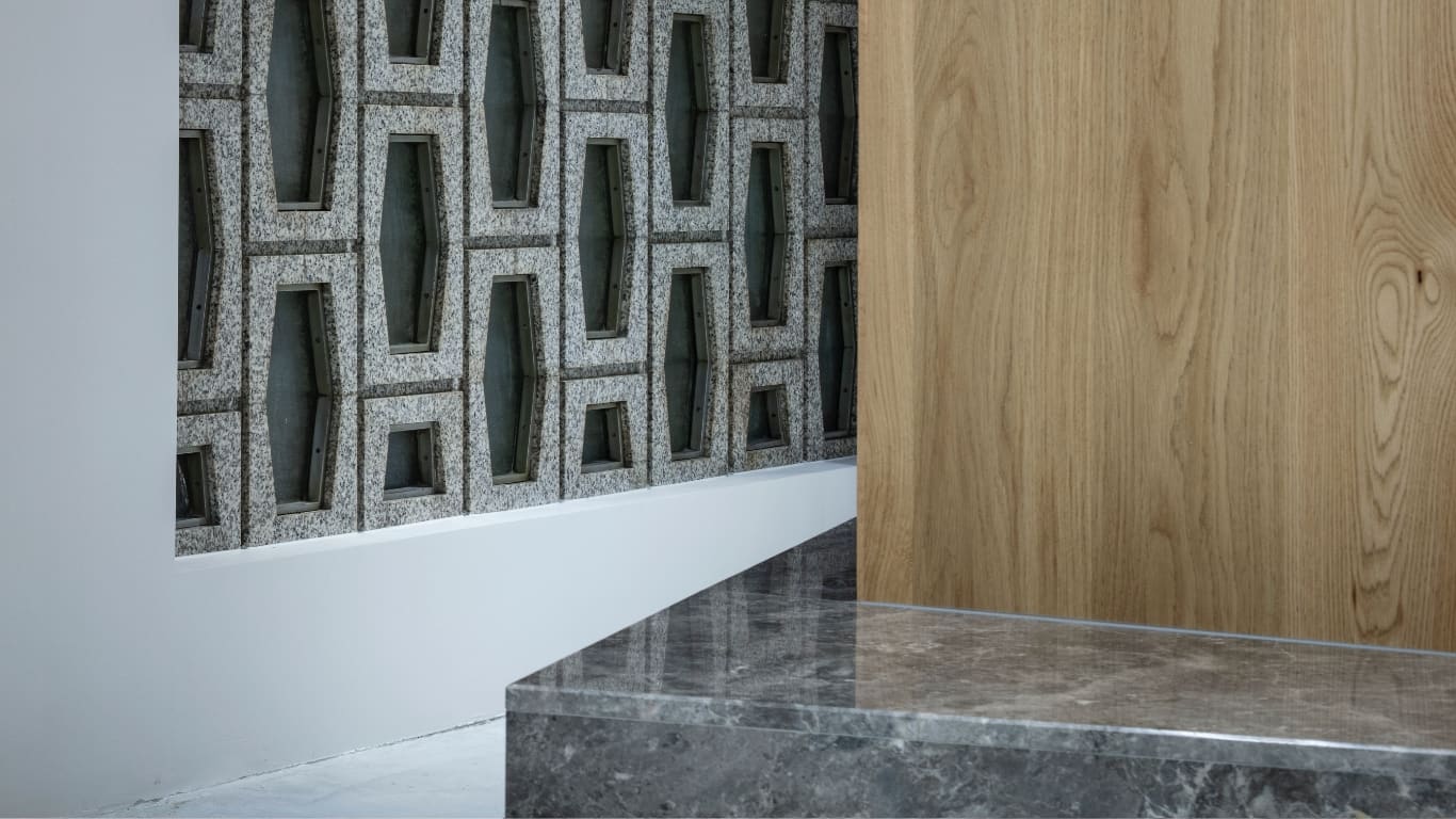
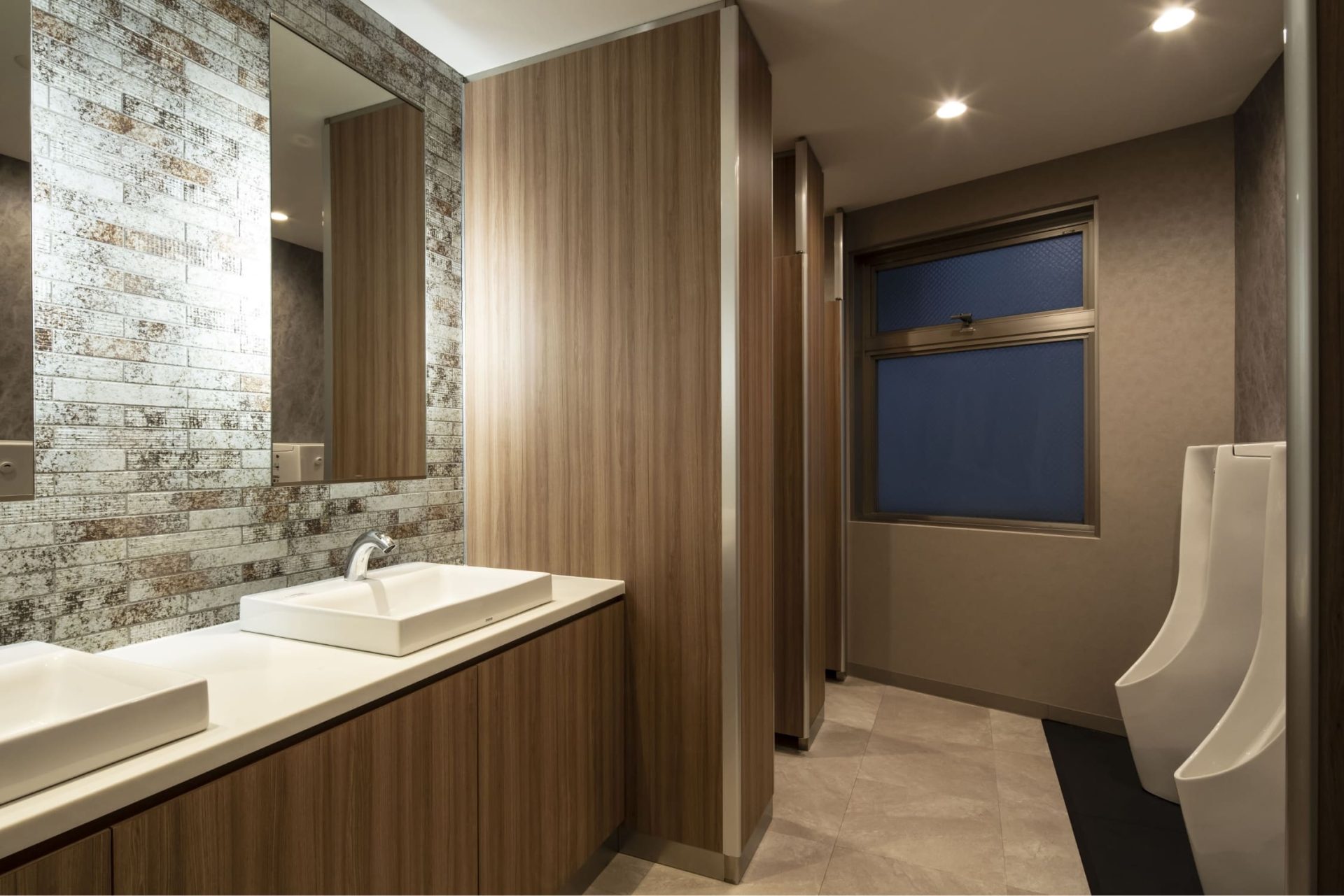
This is the wall design for the hallway extending from the entrance to the elevator lobby. To create a bright and sophisticated space, we incorporated large tiles with a sense of craft and tactility.
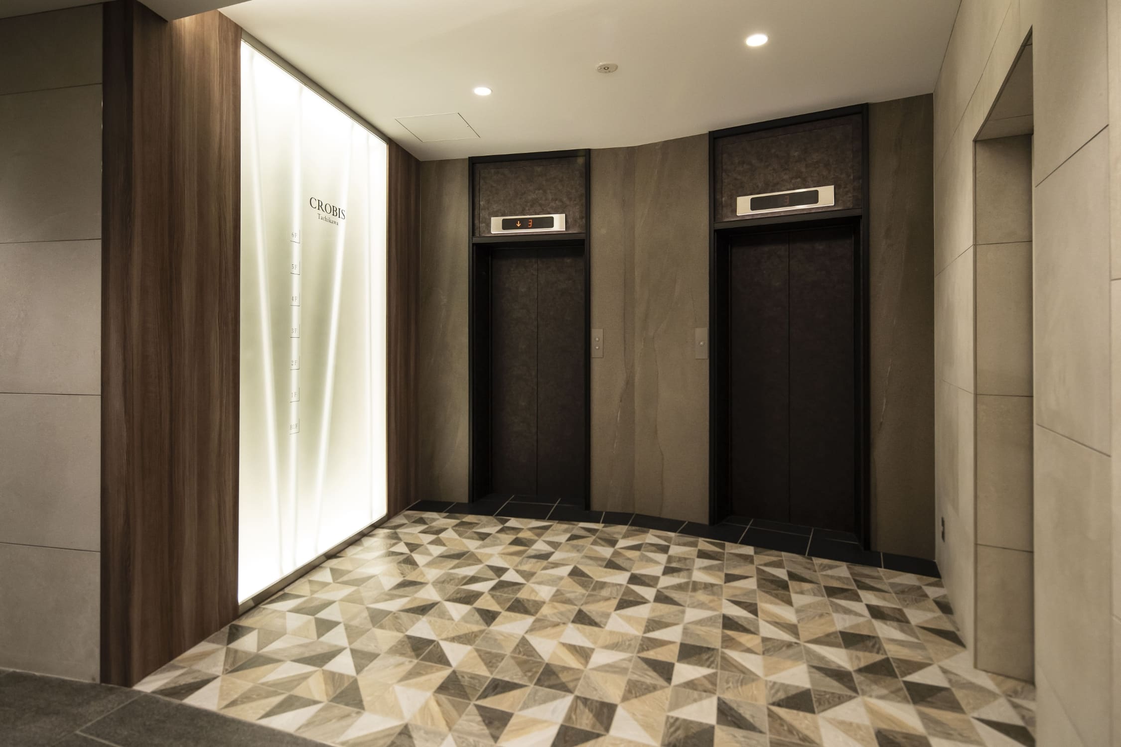
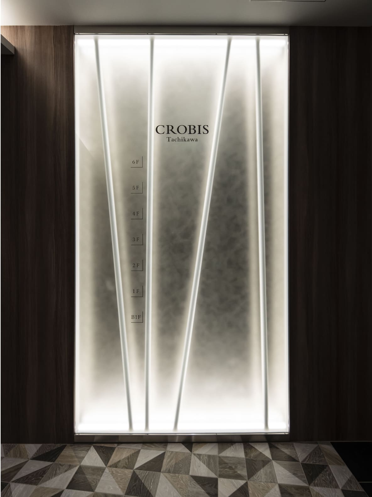
Ensuring a sense of connection with the lush external environment, we used white poles for the floor directory in the elevator lobby to depict leaves and branches moving in the wind. The glass, with a gradated finish, looks like fog.
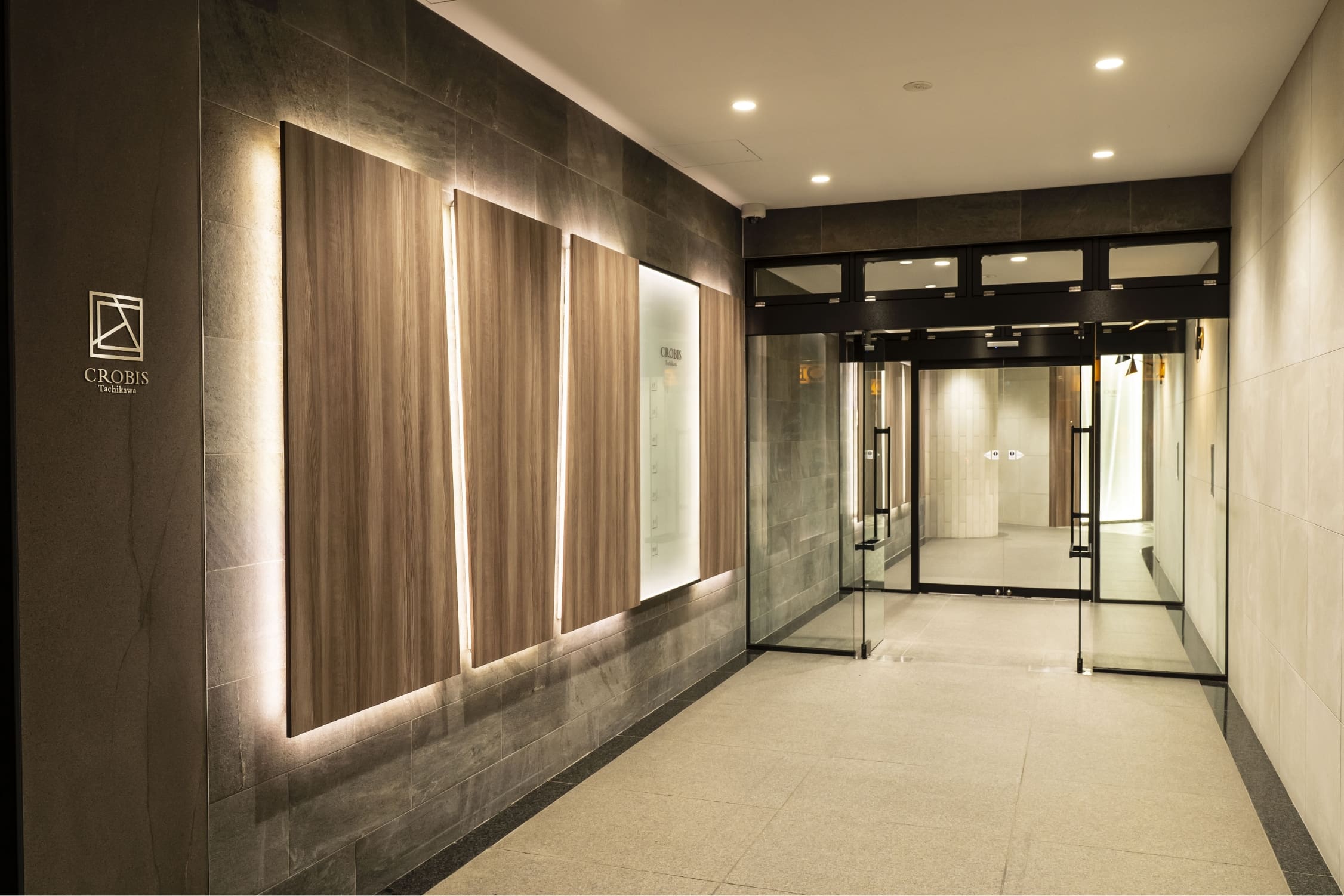
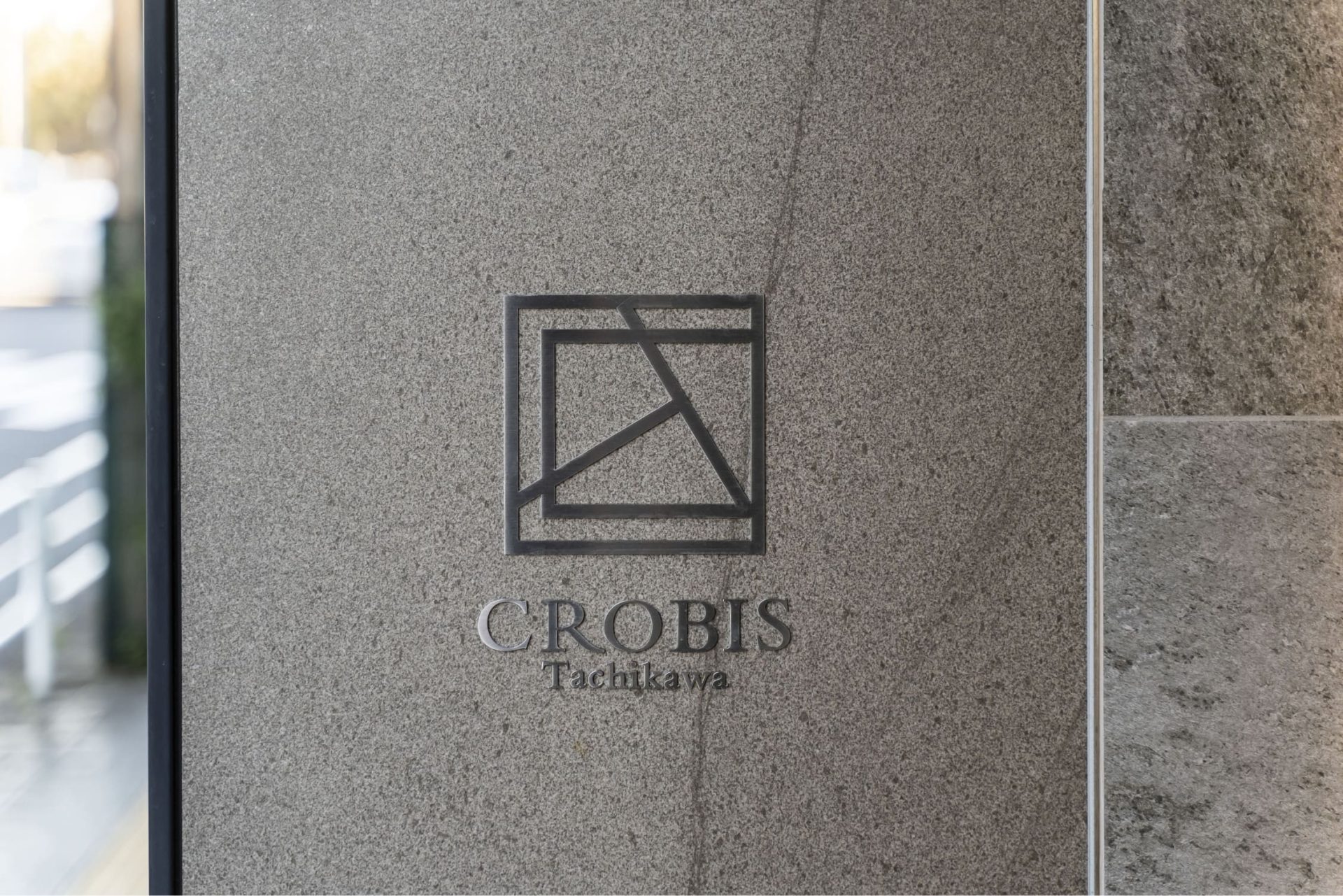
With the combination of the woodgrain panels and indirect lighting, the entrance exudes a different atmosphere between daytime and nighttime. With the renovation, we also replaced the logo on the left side with the new one we designed.
LAUNCH
In a building renovation project, the owner or their tenants usually do not have a clear vision as to what kind of changes they would like to make. Therefore, the key in such a project is how best to add value to the building to make it more appealing. For Crobis Tachikawa, we tried to ensure consistency in the overall direction of our design from the proposal phase while placing importance on the harmony with the surrounding environment and on the improvement of comfort. Through these efforts, we successfully designed a building, which has a dignified beauty not seen in the surrounding buildings and is, at the same time, welcoming and comfortable for the people working there. We also received positive feedback from the owner that the outcome was just as they had imagined.
PROJECT FLOW
-
Clarification of requirements
We clarified the requirements of the client, which was seeking to increase the value of the building, and held meetings with the project members to set the direction of the renovation project. We checked the property to clarify the then-current specifications and the scope for value improvement.
-
Basic plan
We planned the design considering the location and the surroundings of the building to transform it into an office building that resonates with the pleasant environment characterized by the lush park away from the bustle of the city.
-
Cost adjustment
We carried out cost reduction by keeping some parts as they were but without compromising on the new design.
-
Building environment development
For the large entrance, we used interior decoration with woodgrain materials and indirect lighting to create a visual effect to emphasize it as the public face of the building and for warmly welcoming visitors. We held weekly meetings with three relevant companies, including an outside supplier, and discussed the project in detail. We completed the project smoothly without any incidents.
PROJECT DATA
Client: Tokyo Tatemono Real Estate Sales Co.,Ltd.
Project: CROBIS Tachikawa
Business: Restructuring Building Asset Values
Role: Project Management / Design / Construction
Size: 364.81㎡
Location: Tachikawa-shi, Tokyo
CREDIT
- Project Management
Frontier Consulting Co., Ltd.
- Design
Frontier Consulting Co., Ltd.
- Construction
Frontier Consulting Co., Ltd.
- Photograph
TEPPEI HORI
BACK TO ALL
CONTACT
If this project got you interested, please do not hesitate to contact us.
Our specialized staff will be glad to answer any of your questions.
