BANZAN
Project Management/ Design/ Construction
WORK PLACE
3,414㎡
A design concept inspired by the mountains and their undulation after which the company was named
The client, Banzan Co., Ltd., is a company offering online home tutoring, home tutor staffing, and e-learning services, and we were entrusted with the workplace development for their head office consisting of two floors. Drawing on the diagrams made based on the things after which the company was named, we designed a high added-value space in such a way as not only to improve expandability and efficiency as a place for work, but also to facilitate communication and refreshment outside one’s job.
CONCEPT
The client had a clear vision for their new workplace. In addition to the main work area consisting of clusters of assigned desks, which are facing one another, they wanted a space for communication as well as for disseminating information to the outside. So, inspired by “yorozu no yamayama” (meaning “tens of thousands of mountains”) after which the company was named, we came up with two sets of diagrams titled “Change with layer” and “For a switch.” Giving shape to our design concept based on those diagrams, we reflected the concept more directly in the spatial design.
PLANNING
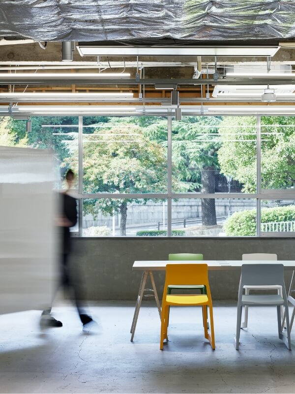
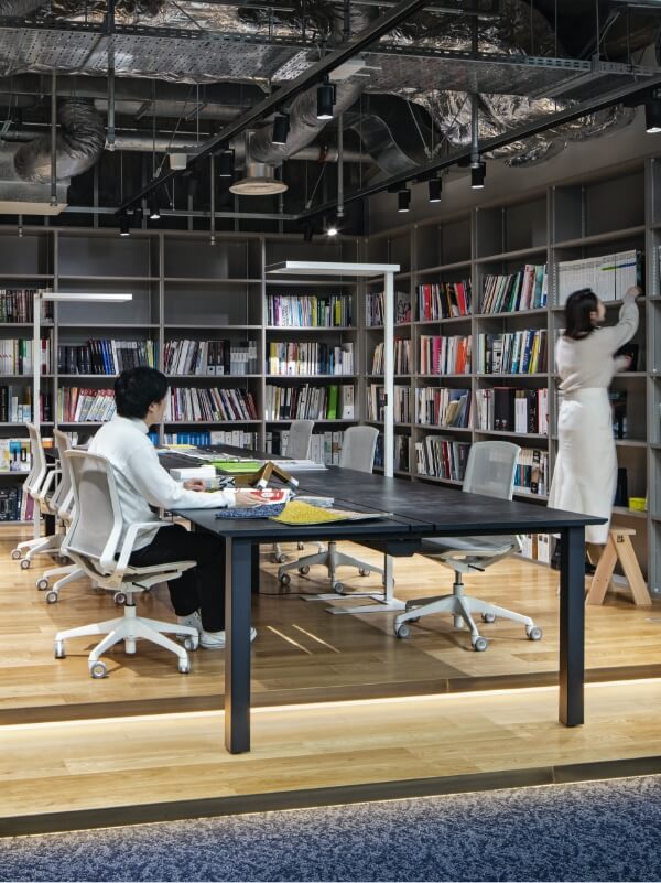
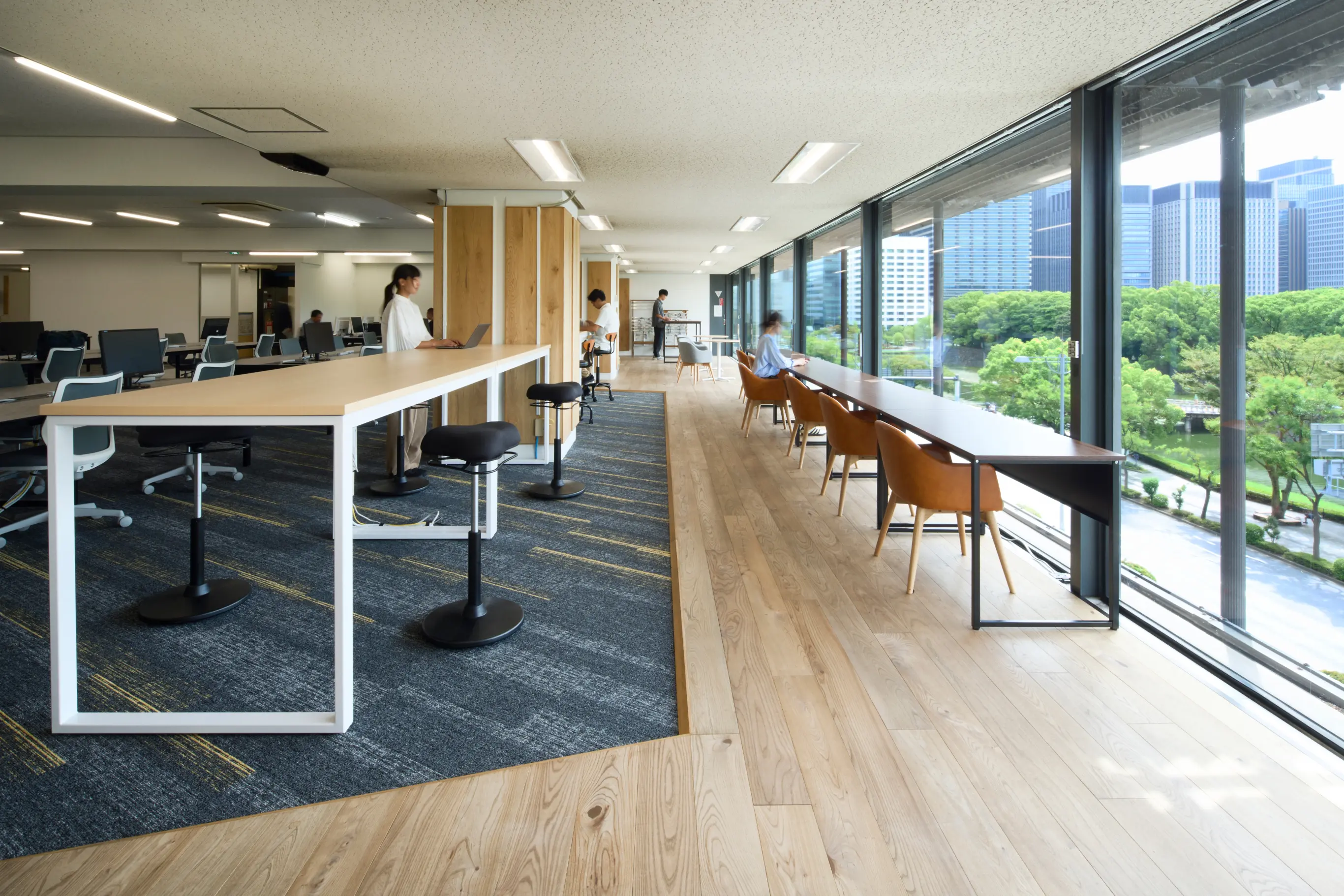
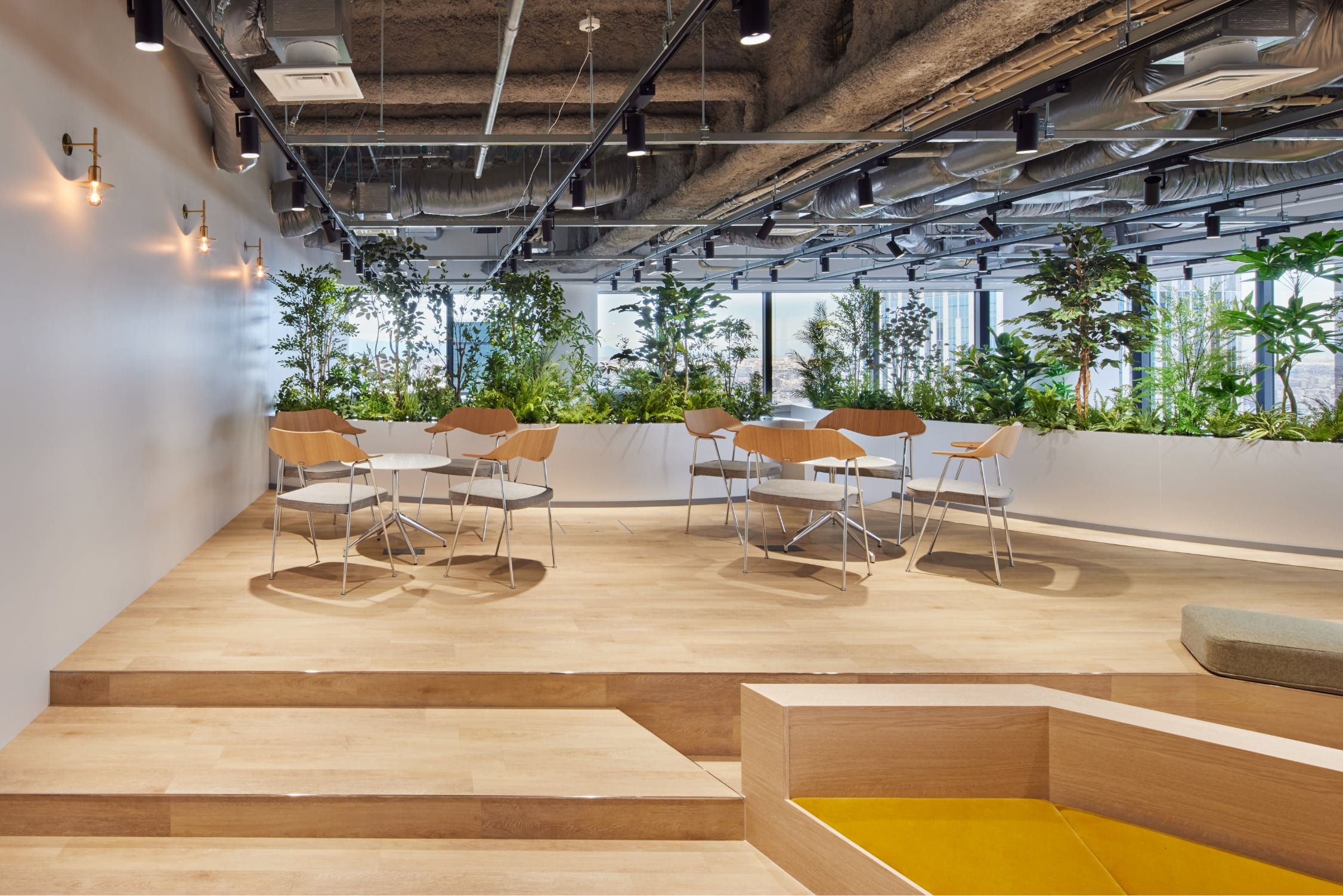
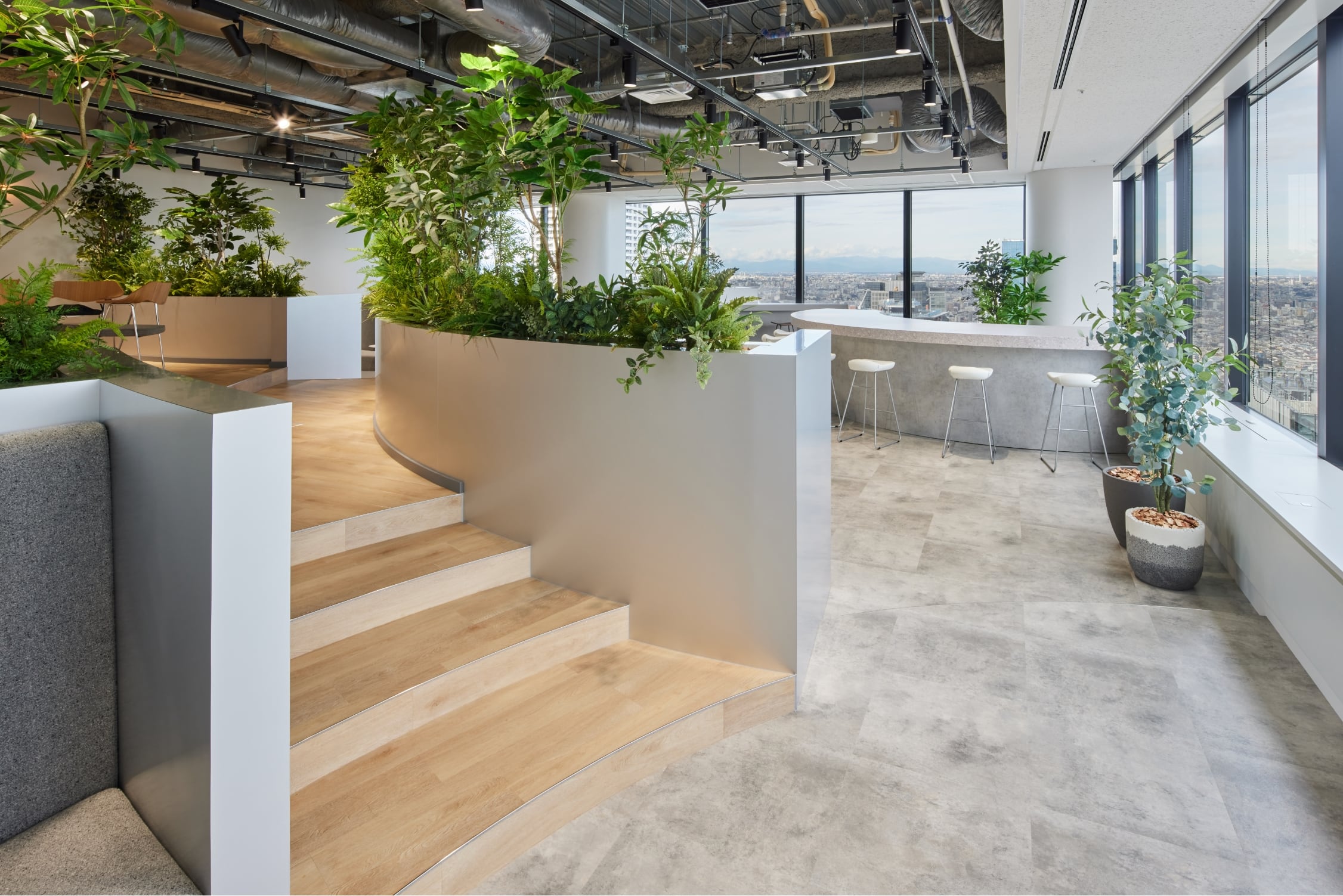
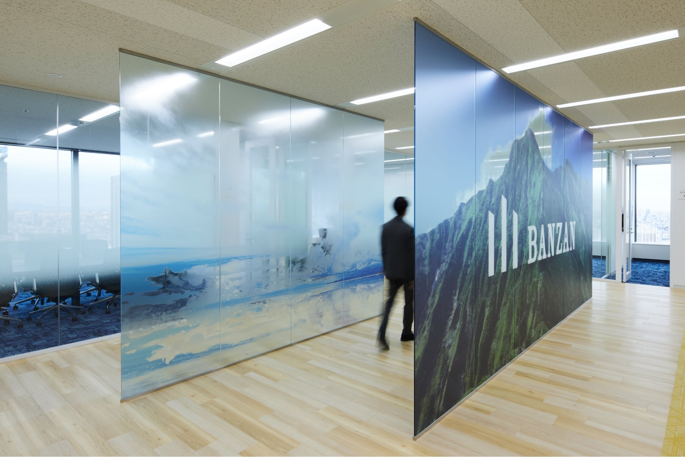
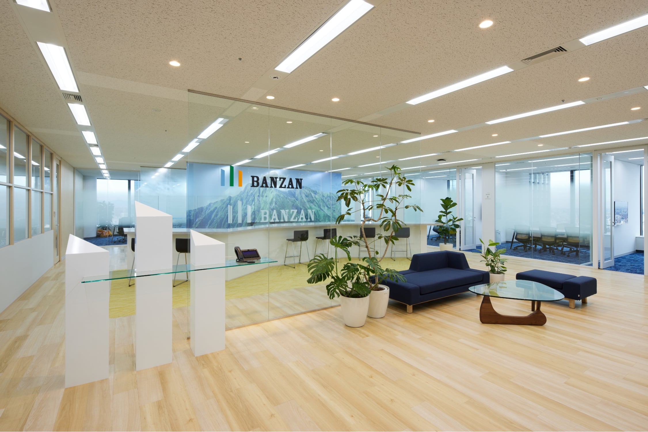
For the entrance that was designed under the concept of “Change with layer,” we set up three giant glass walls in an irregular manner to create layers, thereby not only creating a view that evokes the image of overlapping mountain ranges, but also making sure that the adjacent meeting rooms are not too exposed while allowing for an undisturbed view within the entrance space. For the workspace that was designed under the concept of “For a switch,” we tried to create a transition of a spatial shape that is pleasing to one’s senses, in order to facilitate the flow of people from the uniform main work area to the refreshment area characterized by curves. Moreover, we incorporated different floor heights to help the employees naturally switch between a work mode and a relaxation mode.
DESIGN
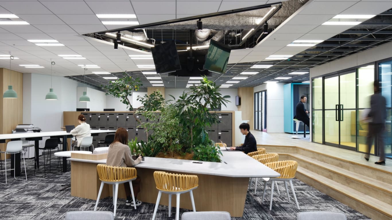
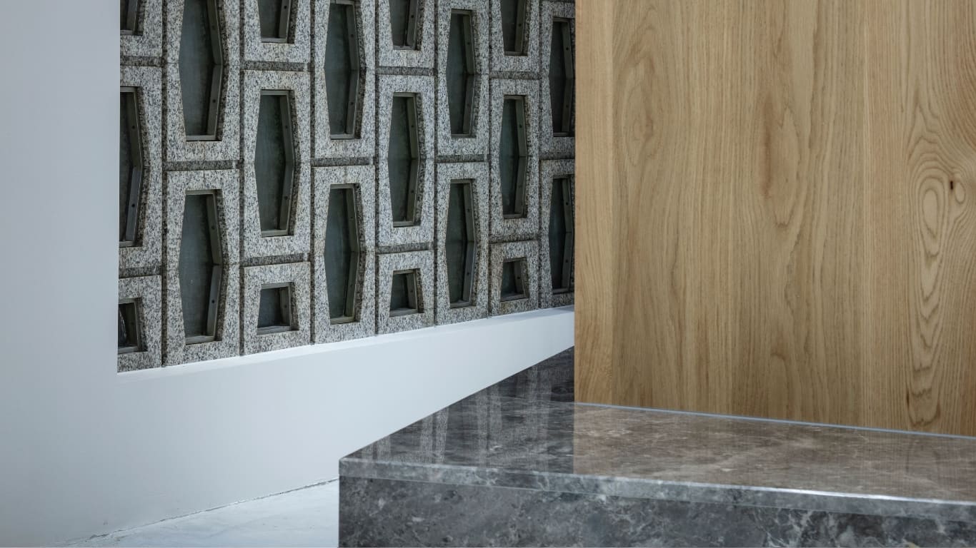
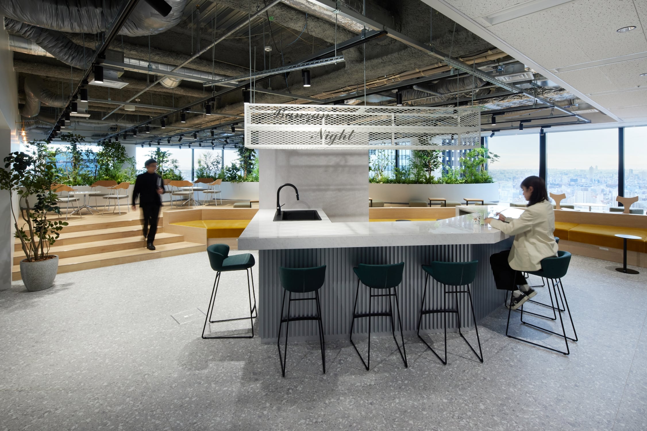
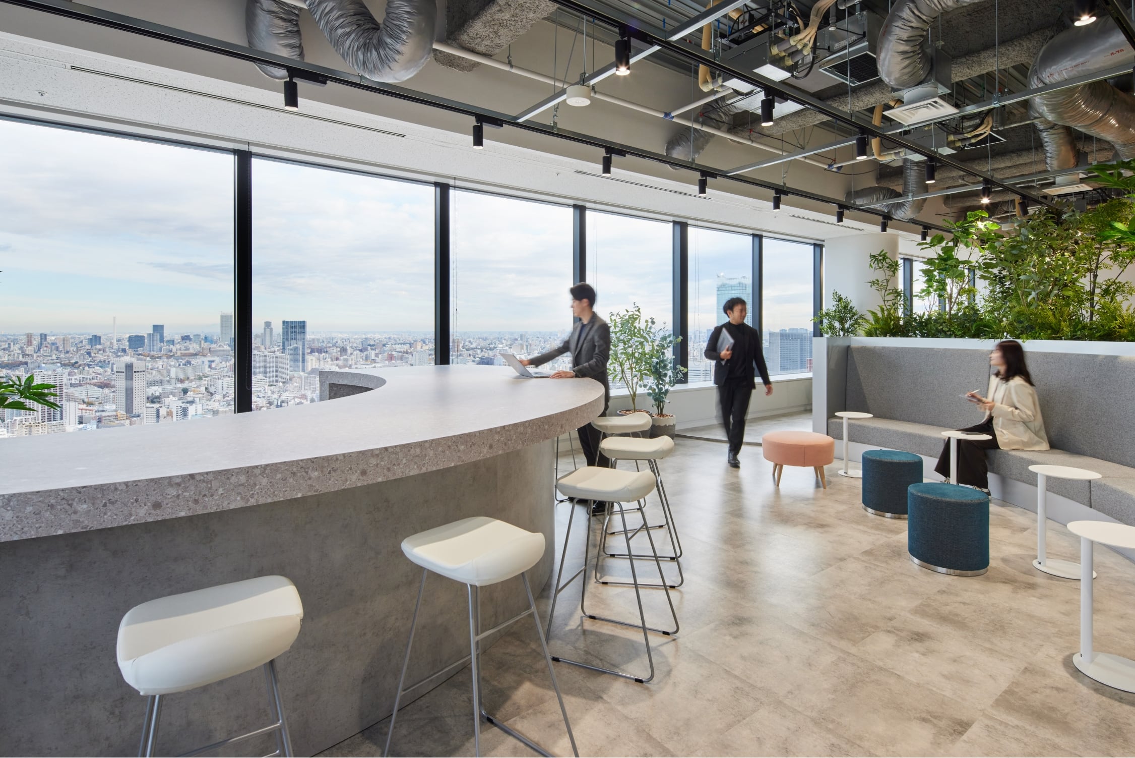
In implementing the two aforementioned design concepts, we meticulously considered how different elements, such as glass window positions, floor shapes and heights, and walls’ appearance, would affect one’s lines of sight (how things would look). Especially, the counter in the refreshment area, from which you can enjoy the entire view of the space with different floor heights, symbolizes this workplace. Also, we used rustic textures and natural colors throughout and used the client’s logo colors—blue, green, and orange—as accent colors.
![]()
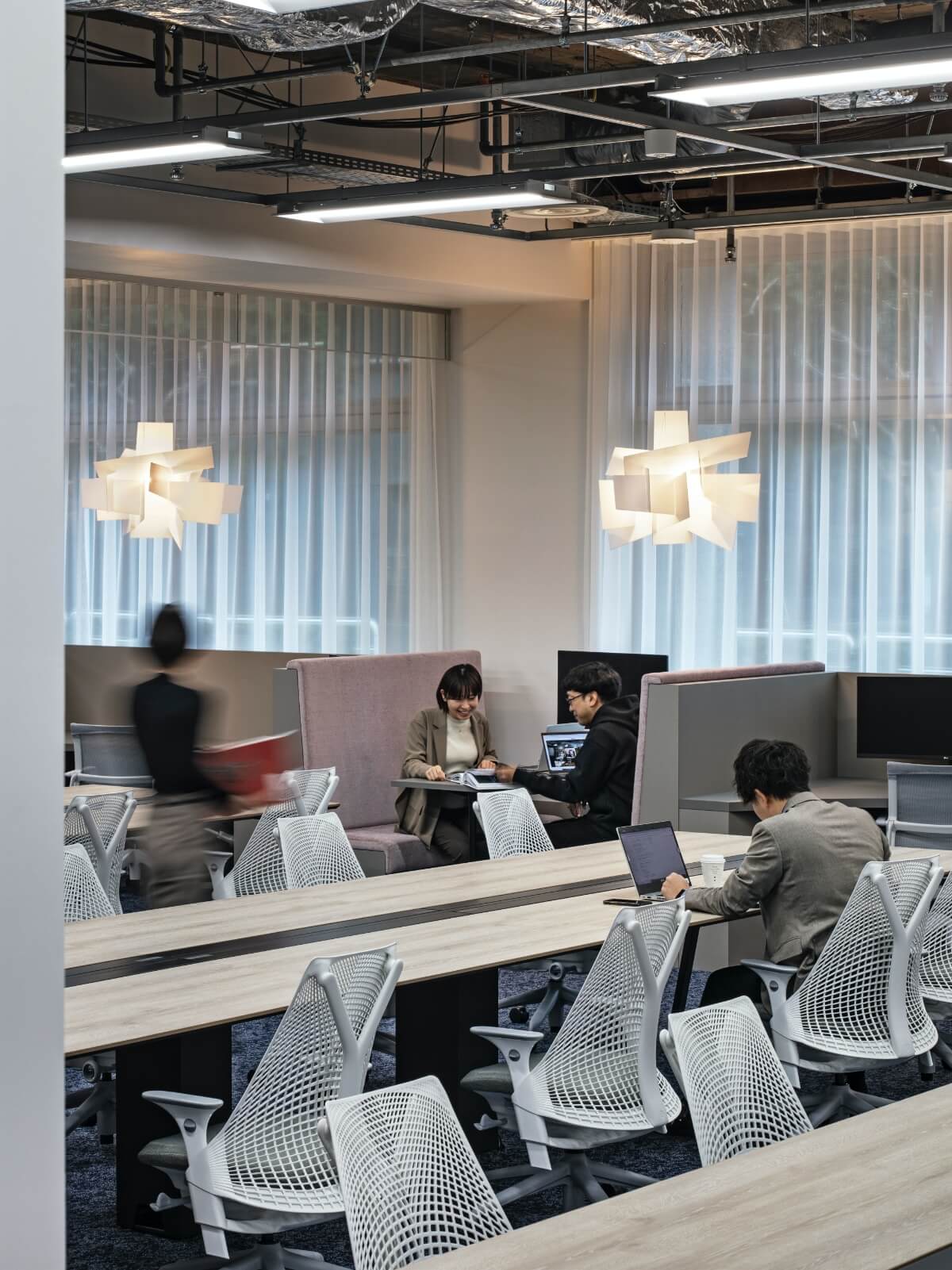
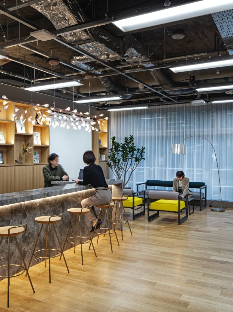
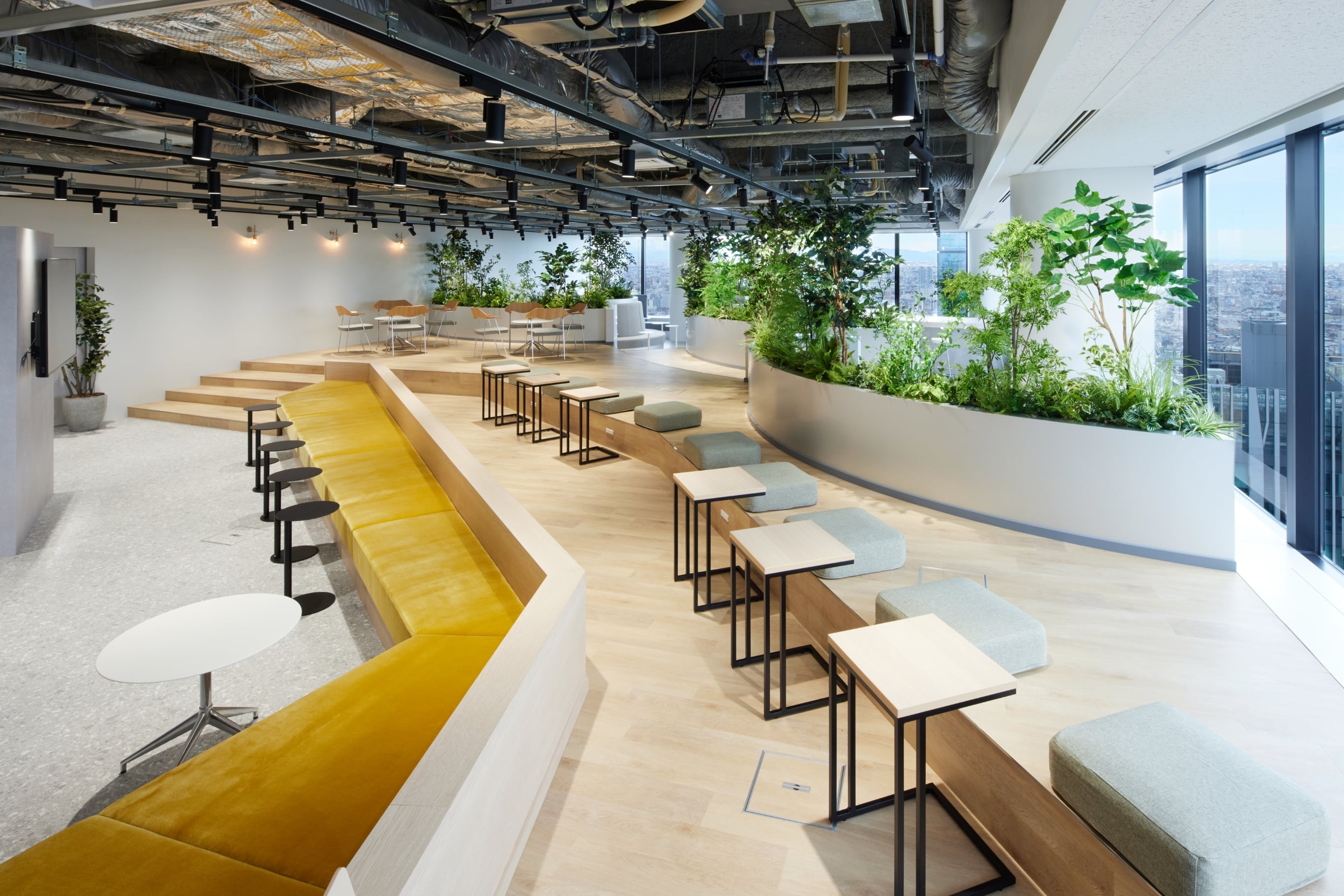
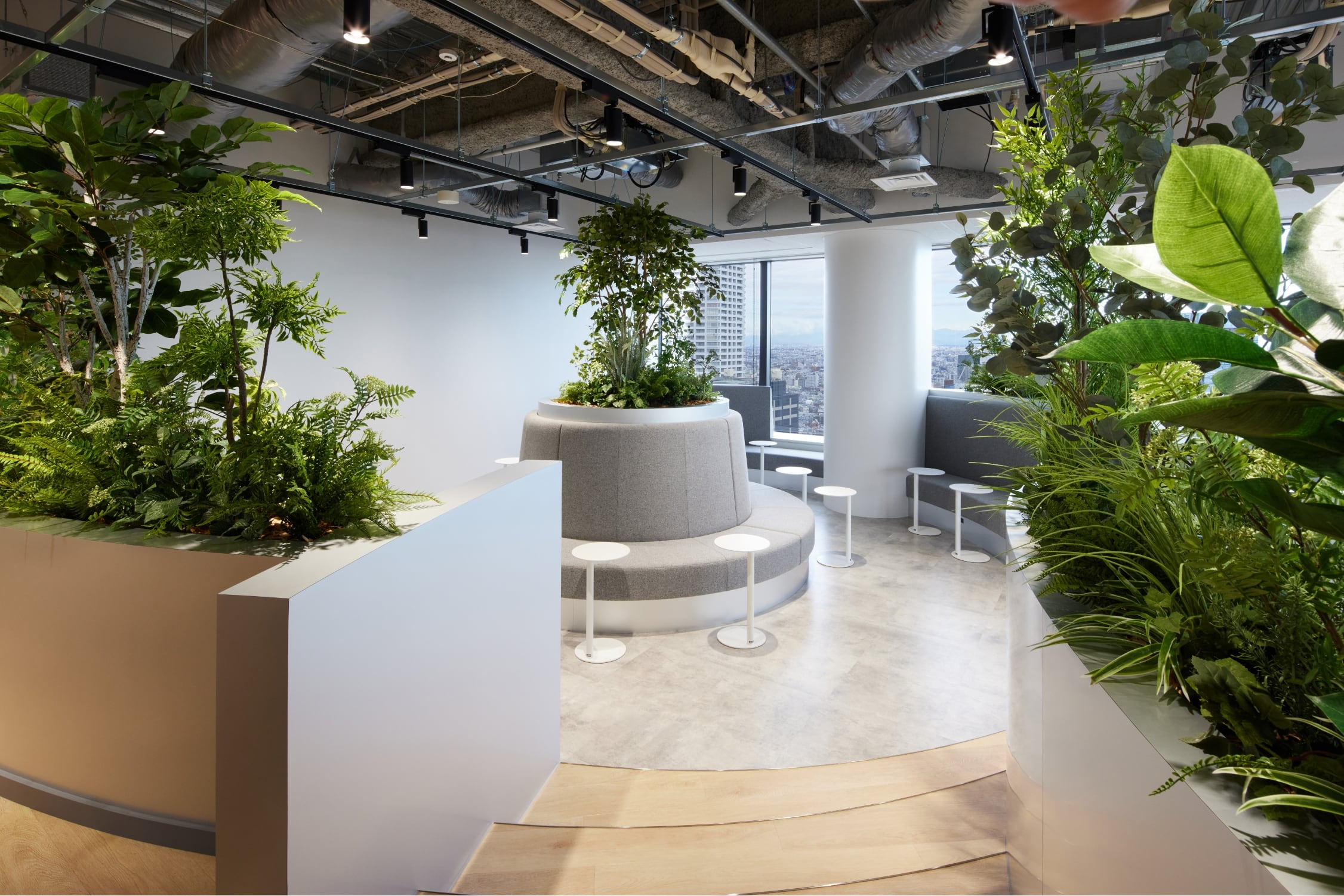
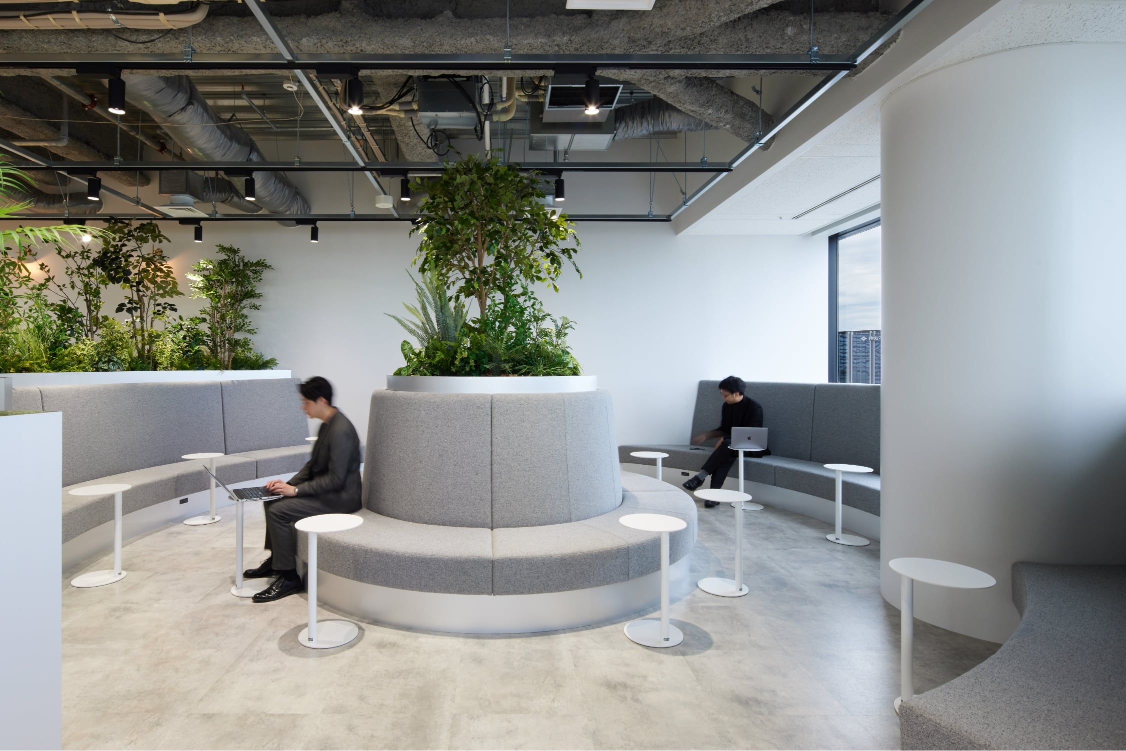
The refreshment area was designed under the concept of “For a switch” to help the employees switch between a work mode and a relaxation mode. The shapes and the setup, which evoke the image of nature in the mountains, facilitate communication among the employees in a different way than the main work area.
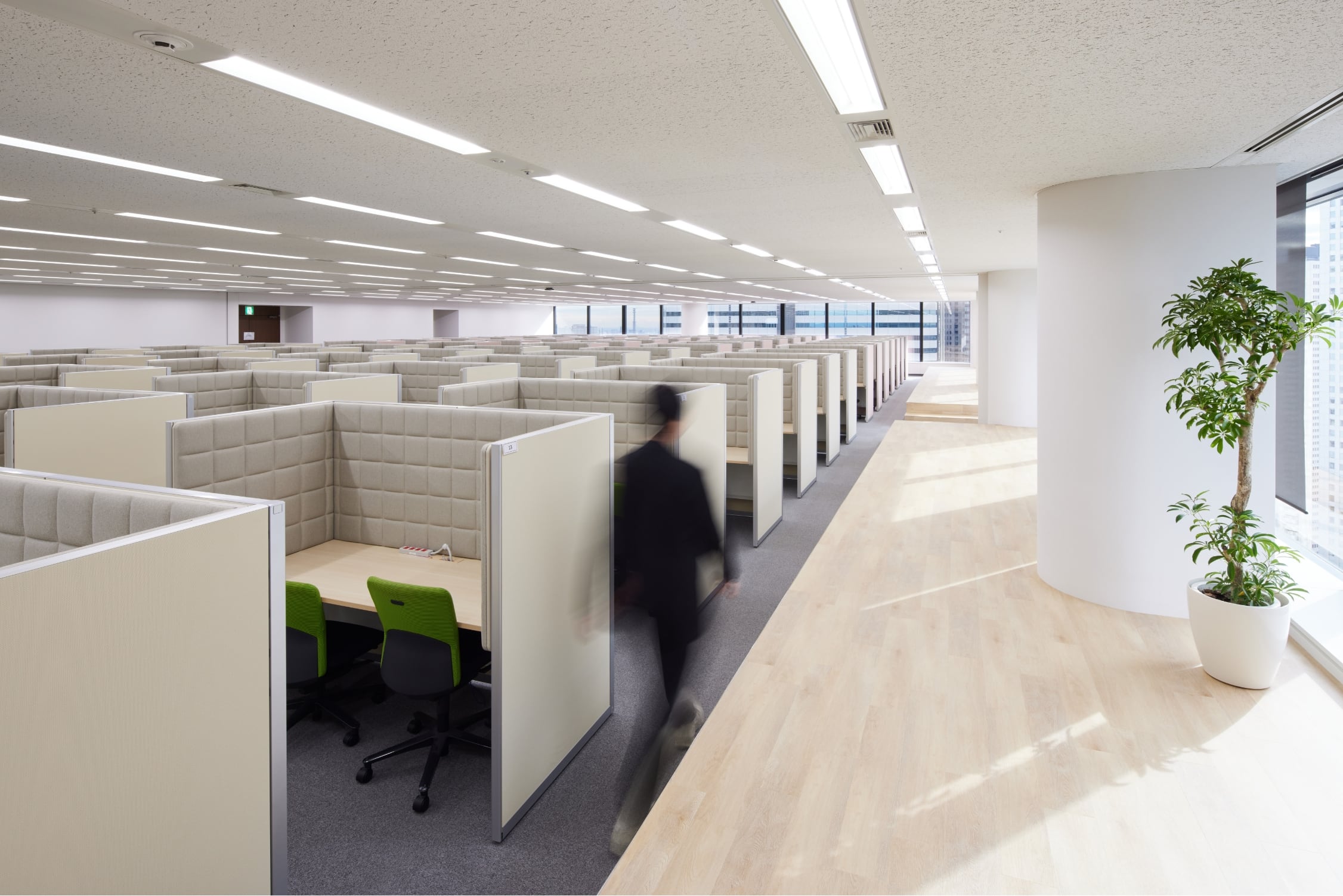
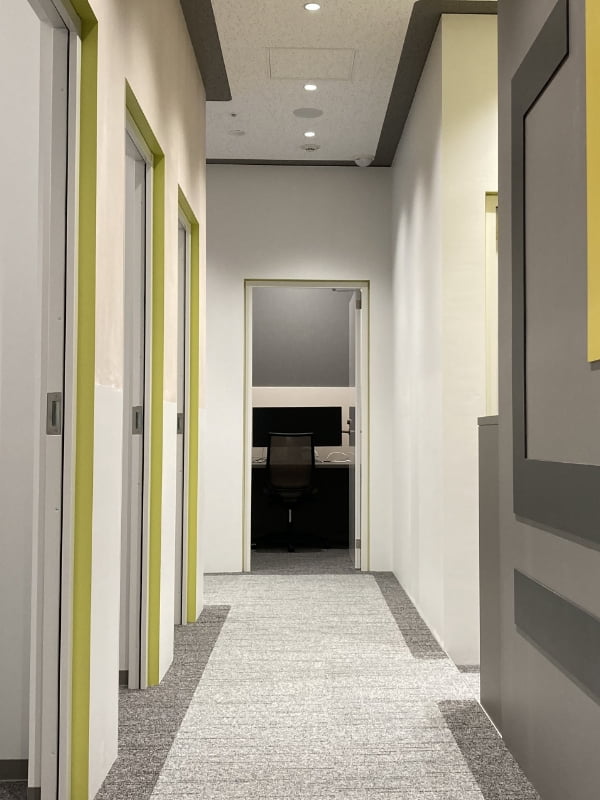
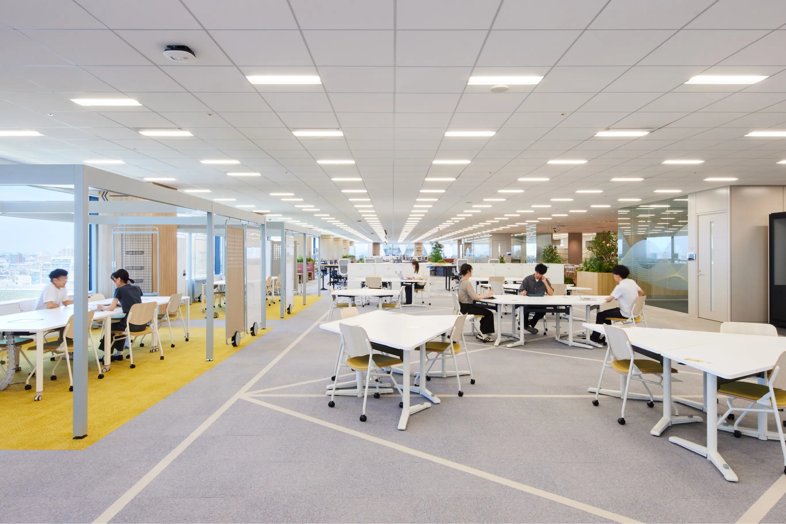
The online work booth space is the most uniform space in the workplace. A sufficient distance has been secured between the booths to prevent echoing and overlapping of sound. Also, we set up raised platforms and arranged the booths uniformly so that the managerial staff can see the entire space for better management efficiency.
![]()
This is the entrance space that was designed under the concept of “Change with layer.” We determined the layout of the glass walls by examining the lines of sight (how things would look) from both the meeting rooms on the right side and the main work area on the left side.
LAUNCH
According to the client, their employees have been able to truly enjoy the refreshment area thanks to the existence of a completely opposite area—the thoroughly-streamlined main work area. As the number of employees increase daily with the expansion of their business, they are hoping that the place for relaxation and recreation, where the employees interact and take a rest differently than before, such as watching sports games or interacting after work, would help them foster new relationships and eventually contribute to the growth of their customers.
PROJECT FLOW
-
Clarification of requirements
The client was considering expanding their office to accommodate the expansion of their online services, so we prepared the office layout after clarifying and sorting the preconditions. The layout, which clearly separates the main work area and the refreshment area, accommodates their branding efforts as well as their plan to increase the number of employees in the future.
-
Concept design
By developing plan and three-dimensional diagrams to incorporate the view of “yorozu no yamayama” (meaning “tens of thousands of mountains”) after which the company was named, we came up with a nature-inspired dynamic basic design.
-
Basic plan
We formulated our basic plan by preparing drawings based on the concept design and by examining practicality and appearance.
-
Cost adjustment
We were able to provide a highly satisfying spatial design through cost adjustment by making adjustments to the materials, finishes, and furniture without compromising the design and manageability.
PROJECT DATA
Client: Banzan Co., Ltd.
Project: Banzan Co., Ltd.
Business: Work Place Construction
Role: Project Management/ Design/ Construction
Size: 3,414㎡
Location: Shinjuku-ku, Tokyo
Category: Professional online tutoring business and home tutoring business
CREDIT
- Project Management
Frontier Consulting Co., Ltd.
- Design
Frontier Consulting Co., Ltd.
- Construction
Frontier Consulting Co., Ltd. / Sumitomo Realty & Development Co., Ltd.
- Photograph
Taijun Hiramoto
BACK TO ALL
CONTACT
If this project got you interested, please do not hesitate to contact us.
Our specialized staff will be glad to answer any of your questions.
